Geo-Intel

Blog

How a bivariate map works (explained simply)

A bivariate map shades every tile by two things at once. Using residential building volume vs. total population in New York City, here is how to read the colours, the units, and the classification choices - in plain language.

Beginner friendlyTwo variablesMap literacy
June 18, 20269 min read

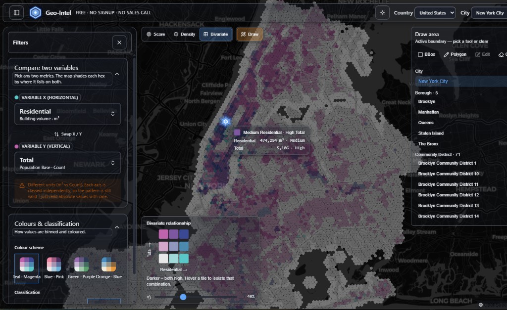
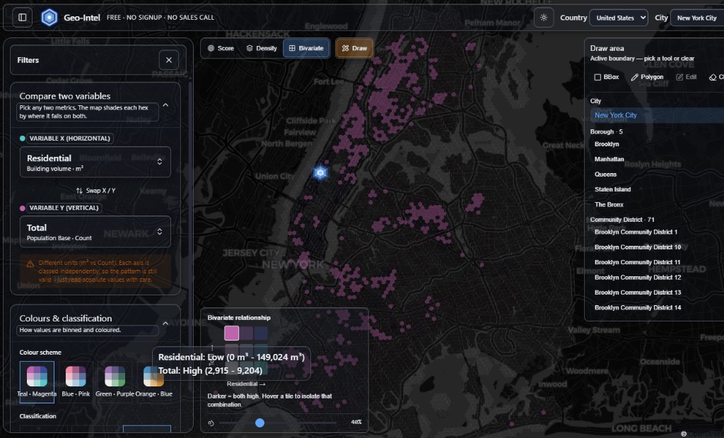
One map, two answers at once

Most maps colour each spot by a single thing — population, say, or how built-up it is. A bivariate map is cleverer: it shades every tile by two things at the same time, so you can see how they line up across a whole city in one glance.

In Geo-Intel you turn this on with the Bivariate tab at the top of the map. You pick two metrics — one for the left-to-right direction (the X axis) and one for the up-and-down direction (the Y axis) — and every tile gets a colour that says where it sits on both at once.

Geo-Intel bivariate map of New York City comparing residential building volume against total population, with the variable and classification panel open
A real bivariate map of New York City. X = residential building volume (m³), Y = total population. Each tile's colour blends where it falls on both metrics.

Our example: buildings vs. people in New York

The screenshots use New York City with two everyday questions stacked together:

  • XResidential building volume (the left-to-right axis) — how much housing is actually built on that patch of land, measured in cubic metres (m³).
  • YTotal population (the up-and-down axis) — how many people are counted as living there.

Put together, the map answers a much richer question than either could alone: where are there lots of homes and lots of people, where are there big buildings but few residents, and where do people live without much built housing around them?

“But one is m³ and the other is a head-count!”

You may have noticed the two metrics use completely different units — cubic metres of building versus a plain count of people. Geo-Intel even pops up a gentle note about it. That is fine, and here is why.

A bivariate map never compares the two numbers against each other. It compares each tile against all the other tiles on the same axis. The X axis is ranked only against other X values, and the Y axis only against other Y values. So “a lot of building” and “a lot of people” are each judged on their own scale — the units never touch.

The pattern you see is always valid even with mismatched units. The only thing to do is read the raw numbers in a tile's pop-up with a little care — don't mentally subtract “200 people” from “243,000 m³,” because they measure different things.

Reading the colour: the 3×3 key

The little colour square in the bottom corner of the map is your decoder. It is a 3×3 grid — three steps for X (Low, Medium, High) crossed with three steps for Y (Low, Medium, High), giving nine possible colours.

Read it like a chart you learned in school: move right for more on the X metric (more residential building), and move up for more on the Y metric (more people). The corner where both are highest gets the deepest, darkest colour — that is the simple rule: darker means both are high at once.

Total (people) — more →
Low / High
Med / High
both high
Low / Med
Med / Med
High / Med
Low / Low
Med / Low
High / Low
Residential (m³) — more →
The 3×3 key. Move right = more residential building; move up = more people. The darkest bottom corner is where both are high at once.

So a pale tile is “low on both.” A strongly teal tile is “lots of building, but not many people.” A strongly magenta tile is “lots of people, but not much built housing.” And the dark corner is “packed with both.” Once you internalise the corners, you can read the whole city without thinking.

Hover any tile to see the exact numbers

Colours give you the big picture; the pop-up gives you the receipts. Hover (or tap) a tile and Geo-Intel tells you which of the nine combinations it belongs to, plus the real value behind each axis.

Hover pop-up on a New York bivariate tile reading Low Residential, High Total, with residential between 0 and 149,024 cubic metres and population between 2,915 and 9,204
Hovering a tile in NYC: this one is 'Low Residential · High Total' — low residential building volume but high population for that area.

Notice the read-out names the band (“Low,” “High”) and the raw value beside it. The highlighted square in the key shows exactly which of the nine cells you are on. You can also hover a cell in the key to light up every matching tile on the map — a fast way to ask “show me everywhere that's high-building, low-people.”

Picking a colour scheme

The relationship is the same no matter which palette you choose — the colours are purely about readability and taste. Geo-Intel ships four hand-tuned schemes (Teal · Magenta, Blue · Pink, Green · Purple, Orange · Blue). Each one keeps the same logic: one colour family leans toward the X metric, another toward the Y, and they blend toward a dark corner where both are high.

Pick whichever you can read most comfortably — on a dark map, on a bright day, or for colour-vision needs. Switching palettes is instant and changes nothing about the data underneath.

Where do the Low / Medium / High lines go?

Here is the one genuinely important choice on the panel: Classification. To turn thousands of different values into just three bands, Geo-Intel has to draw two cut lines — one between Low and Medium, one between Medium and High. Where it draws those lines changes which tiles look high or low.

That is not a trick or a bias — it is a real decision every map-maker faces, and there is no single “correct” answer. So Geo-Intel gives you three well-known methods and lets you switch between them live. None of them re-fetches data; they just re-draw the cut lines.

Quantile

Equal number of tiles in each band.

How it works. Geo-Intel sorts every tile from lowest to highest, then splits the list into three equal-sized piles. The bottom third is “Low,” the middle third is “Medium,” the top third is “High.”

How it feels. Always shows a full spread of colour, even when most tiles are bunched together. Great for spotting the relative top and bottom of a city.

Best for. Skewed, lopsided data (most things are small, a few are huge) — like building volume.

Equal interval

Equal value range in each band.

How it works. Geo-Intel takes the smallest and largest value and chops the gap between them into three equal-width slices — for example 0–100, 100–200, 200–300 — regardless of how many tiles land in each.

How it feels. Honest about real magnitude, but if one tile is a giant outlier, almost everything can fall into the bottom slice and the map looks flat.

Best for. Evenly spread data, or when the actual size of the gap between values matters.

Natural (Jenks)

Bands follow the natural gaps in the data.

How it works. Uses the Jenks natural-breaks method: it hunts for the spots where the data has real gaps and draws the cut lines there, so each band holds values that are genuinely similar to each other.

How it feels. Usually the most “true to the data” look — clusters that belong together stay together, and the breaks land where nature already put them.

Best for. Data that forms clear clumps, when you want the map to reflect real groupings.

A closer look at “Natural” (Jenks natural breaks)

“Natural” is worth a sentence more because it is the most thoughtful of the three. It uses an algorithm called Jenks natural breaks, named after the cartographer George Jenks. The idea is intuitive: real-world data usually clumps, and you want the bands to fall in the empty gaps between clumps rather than slicing straight through a tight cluster.

Imagine plotting every tile's value on a number line. You would see little crowds of dots with gaps between them. Jenks mathematically finds the cut points that keep each crowd as tightly together as possible while making the crowds as different from each other as possible. The result is bands that match how the data actually groups in the real world — which is why it so often “looks right.”

Quantile guarantees an even spread of colour, Equal interval respects raw magnitude, and Natural respects the data's own shape. Flip between them and watch the map — if the big picture barely changes, your pattern is robust. If it changes a lot, it means a few tiles sit right on a boundary, which is itself useful to know.

Which one should you pick?

A simple rule of thumb, no statistics required:

  • Just exploring and want to see the strongest and weakest areas? Start with Quantile — it always fills the map with contrast.
  • Care about the true size of the gap between places (e.g. one area has twice the housing of another)? Use Equal interval.
  • Want the map to honour the natural clusters in the city? Use Natural (Jenks).

The honest best practice is to try all three. They are one click apart, and the way the map shifts (or doesn't) tells you how solid your story is.

The whole idea, in four lines

  • A bivariate map colours every tile by two metrics at once — X goes left-to-right, Y goes bottom-to-top.
  • Mismatched units are fine: each axis is ranked on its own, so m³ and head-counts never get compared directly.
  • Darker corner = both high. Hover a tile or a key cell to see exact numbers and isolate a combination.
  • Classification (Quantile, Equal, Natural/Jenks) decides where the Low/Medium/High lines fall — switch live to test how solid the pattern is.

Quick questions

What is a bivariate map?

A bivariate map colours every tile by two metrics at the same time - one running left-to-right (X) and one running bottom-to-top (Y) - so you can see how the two relate across a whole area in one glance.

Does it matter that the two variables use different units?

No. Each axis is ranked only against other values on the same axis, so cubic metres of building and a count of people are never compared directly. The pattern stays valid; just read the raw numbers in a tile's pop-up with care.

How do I read the bivariate colour key?

It is a 3x3 grid: move right for more of the X metric and up for more of the Y metric. Paler tiles are low on both, and the darkest corner means both metrics are high at once.

What is the difference between Quantile, Equal, and Natural classification?

Quantile puts an equal number of tiles in each band, Equal interval makes each band cover an equal value range, and Natural (Jenks) places the band edges in the natural gaps of the data so similar values stay grouped together.

What are Jenks natural breaks?

Jenks natural breaks is a classification method that finds the cut points keeping each band's values as similar as possible while making the bands as different from each other as possible - so the colours match how the data actually clusters.

See it on a real map

The best way to understand the score is to play with it. The full app is free, with no signup and no sales call.