Geo-Intel

Blog

How Geo-Intel scores a neighborhood (explained simply)

Every colored tile on the map is a 0-100 score answering one question: how good is this exact spot for what you care about? Here is what that number means, in plain language.

Beginner friendlyNo jargonInteractive
June 17, 20266 min read

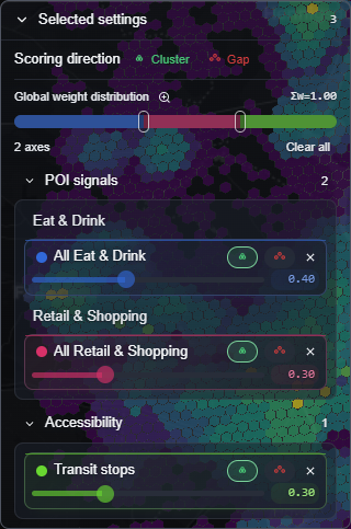
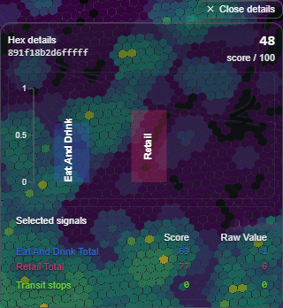
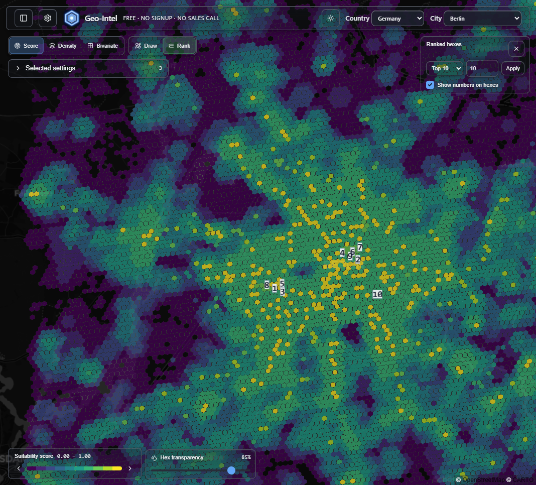
First, what is “the score”?

When you open the map, the whole city is covered in little colored tiles. Each tile has a single number behind it - a score from 0 to 100 - that answers one simple question: how good is this exact spot for what I care about?

You read it by color. Bright yellow-green means a strong match, and dark purple means a weaker one. That is the whole idea - you can scan an entire city in seconds and instantly see where the good spots are.

Geo-Intel map of Berlin covered in colored hexagon tiles, brighter tiles showing higher-scoring areas
A real Geo-Intel score map of Berlin. Every tile is one score - brighter tiles are stronger matches, darker tiles are weaker ones.

Think of it like a report card for a place

A student's report card blends grades from several subjects into one overall result. Geo-Intel does the same thing for a location: it looks at four different “subjects” about each spot and blends them into one easy score. No spreadsheets, no math - just one number you can compare.

The four things every score looks at

These are the four “subjects.” You do not need to understand the data behind them - just what each one means in plain terms.

Demand

How much a spot naturally pulls people in.

Lots of cafes, shops, and attractions nearby usually means more foot traffic.

Competition

How many similar places are already there.

You can choose to sit next to competitors, or hunt for the gaps they have missed.

Demographics

Who actually lives in the area.

Age, households, and income from public census data - the people around the spot.

Accessibility

How easy it is to get there.

Nearby transit stops and good connections mean more people can actually reach it.

Watch four layers become one score

Here is the magic, in motion. Each of the four signals is its own layer of colored tiles. Geo-Intel stacks them up and blends them together into a single tile - and that final color is exactly what you see on the map. Press play and watch it happen.

You do not have to do any of this yourself. It runs automatically for every tile in the city at the same time. The animation is just showing you what is happening behind one of them.

You decide what matters most

Here is the part that makes the score yours. Back to the report card: a school can decide exams are worth 80% and homework 20%. Geo-Intel lets you do the same - you choose how much each of the four signals counts. Slide one up and the whole map re-scores instantly.

You can also flip a signal's direction. For most things, more is better (you want more demand). But sometimes less is better - for example, you might want fewer competitors. Geo-Intel calls these two modes Cluster (more is better) and Gap (less is better).

Try it - drag a slider and watch the score change.

One-Hex Scoring Walkthrough

Each pᵢ is this hex's percentile rank (0-100) on that axis (relative to the map area)—not a raw measurement.

  • Demand+w1=0.06p1=
  • Competitionw2=0.90p2=
  • Demographics+w3=0.02p3=
  • Accessibility
    +w4=0.02p4=Σwi = 1
Composite scorePrime
89/ 100

+0.06×82 0.90×10 +0.02×71 +0.02×63=88.6

In the full app, these same controls live in a panel on the side of the map. Change a slider there and the colors across the whole city update live.

Geo-Intel scoring panel with sliders to set how much each signal counts and Cluster or Gap direction toggles
The real controls in the app: a slider for each signal, a Cluster/Gap toggle, and a live total. Move one and the map re-scores instantly.

Reading the colors

The little color bar on the map is your key. It runs from dark (low scores) to bright (high scores), and it shows the lowest and highest scores currently on screen. So the brightest tiles are always the strongest spots for the way you set things up.

Geo-Intel suitability score legend showing the color scale from low to high scores
The legend is the key: darker means a lower score, brighter means a higher score.

No black box: see exactly why

A score is only useful if you can trust it. So nothing is hidden. Click any tile and Geo-Intel shows you the full breakdown - how each of the four signals contributed to that tile's score. If a spot scored high, you can see why.

Geo-Intel hex detail panel showing the per-signal score breakdown and raw values for a single tile
Click any tile to see the breakdown - its overall score plus exactly which signals lifted or lowered it.

Where do the best spots stand out?

You do not have to hunt for the brightest tiles by eye. Geo-Intel can list the top-scoring spots for you, ranked highest to lowest, so your shortlist is ready in a glance.

Geo-Intel map with the top ten highest-scoring tiles numbered one through ten
Turn on Rank and Geo-Intel numbers the top spots right on the map - a ready-made shortlist.

The whole idea, in three lines

  • Every colored tile is a 0-100 score - brighter is a better match.
  • The score blends four signals (demand, competition, demographics, accessibility), and you decide how much each one counts.
  • Click any tile to see exactly why it scored the way it did - nothing is hidden.

Quick questions

What does the score on the map actually mean?

Each colored tile is a 0-100 score for one small patch of the city. Higher (brighter) means a better match for what you care about; lower (darker) means a weaker match.

How does Geo-Intel score a location?

It blends four signals - demand, competition, demographics, and accessibility - for every 100-meter tile, then shows a transparent per-signal breakdown so nothing is a black box.

Can I change how the score is calculated?

Yes. You decide how much each signal counts and whether more or less of it is good, and the map re-scores live so the result reflects your own priorities.

Do I need any technical or data skills to read it?

No. You just read colors on a map and, if you want, click any tile to see why it scored the way it did. There is no setup, signup, or math required.

Is the score a guarantee that a spot is good?

No. It is a fast, transparent first pass built on public data for comparing and shortlisting areas. Confirm a final decision with on-the-ground visits and any required checks.

See it on a real map

The best way to understand the score is to play with it. The full app is free, with no signup and no sales call.